27 KiB
| title | layout | slug | summary | draft | hero | study | |||||||||||||||||||||||||||||||||||||||||||||||||||||||||||||||||||||||||||||||||||||||||||||||||||||||||||||||
|---|---|---|---|---|---|---|---|---|---|---|---|---|---|---|---|---|---|---|---|---|---|---|---|---|---|---|---|---|---|---|---|---|---|---|---|---|---|---|---|---|---|---|---|---|---|---|---|---|---|---|---|---|---|---|---|---|---|---|---|---|---|---|---|---|---|---|---|---|---|---|---|---|---|---|---|---|---|---|---|---|---|---|---|---|---|---|---|---|---|---|---|---|---|---|---|---|---|---|---|---|---|---|---|---|---|---|---|---|---|---|---|---|---|---|---|---|---|
| Legacy app refresh | study | legacy | Reshaping a complex and outdated school forms workflow into a clearer, calmer experience for administrators and families. | false |
|
|
{{< intro id="intro" title="Designing for clarity over polish in complex admin software" >}}
Wallabyte† supports schools and families through critical paperwork—from permissions to registrations and even student health information. It solved this and more, but was woefully unusable, even by admin-ware standards. The forms experience had become frustrating enough that major customers, like NYC, were at risk of churn unless the workflow became clearer, calmer, and easier to use.
This case study covers how I approached that challenge—from identifying the highest impact issues to shaping a more coherent forms experience—all within the paradox of a userbase simultaneously frustrated yet resistant to change.
It is also meant to show how I simplify complex systems; work in a difficult set of circumstances; and design to please the user, not myself.
{{< /intro >}}
{{< overview id="overview" title="Project overview"
}}
Wallabyte had two halves: an administrative app for creating and managing forms, and a parent- and staff-facing app for completing forms. This redesign only touched this second, smaller part—called Wallabyte Central—due to the particular churn risk it was creating.
The existing experience had become painful enough that major customers, including NYC, were at risk of leaving unless the product became significantly easier to use. My job was to figure out how to make their mobile and desktop experiences more efficient and pleasant.
At the same time, Wallabyte was also rebranding as Schooltastic Forms, now a year after it had been acquired by Schooltastic. This project was my first interaction with this app and team, and not only did I have to get up to speed quickly, its users could be seeing a lot of sudden change.
{{< /overview >}}
{{< problems id="problems" title="Core problems" >}}
We identified four main UI/UX issues to target in this refresh, following my own deepdive into the product and several meetings with the product manager.
I was fortunate to share an entirely fresh set of eyes on a mature product, and it helped question a lot of assumptions that had been taken for granted over the years. This app necessitated multiple demo accounts with different permissions and scopes, and I spent the first week cataloguing my experiences.
These four problems became the core problem statements we used to frame the work and evaluate whether the redesign was actually solving the right things. The PM initially estimated a six-month path from early design through implementation.
{{< problem title="Forms were too hard to find and track"
}}
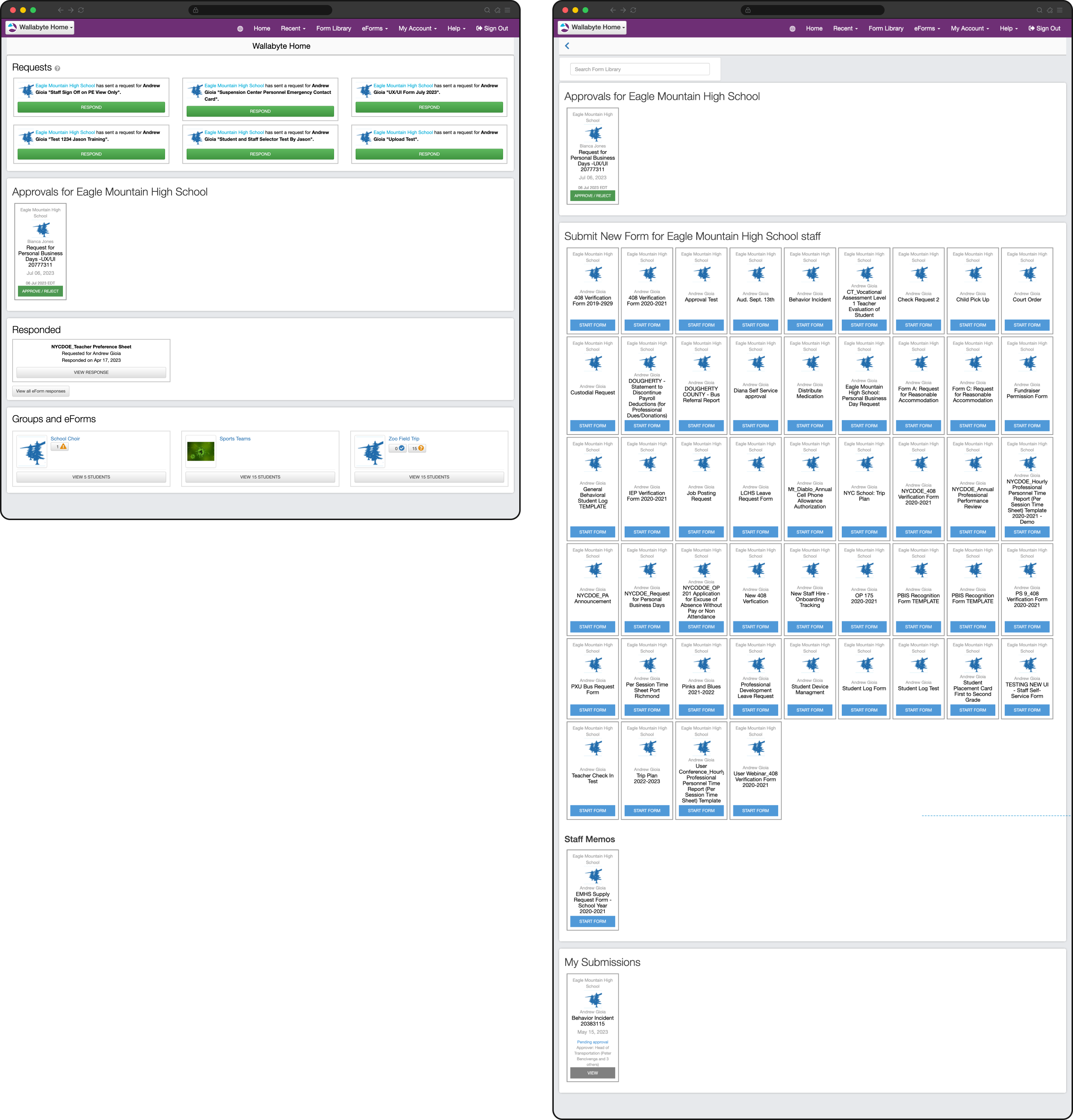
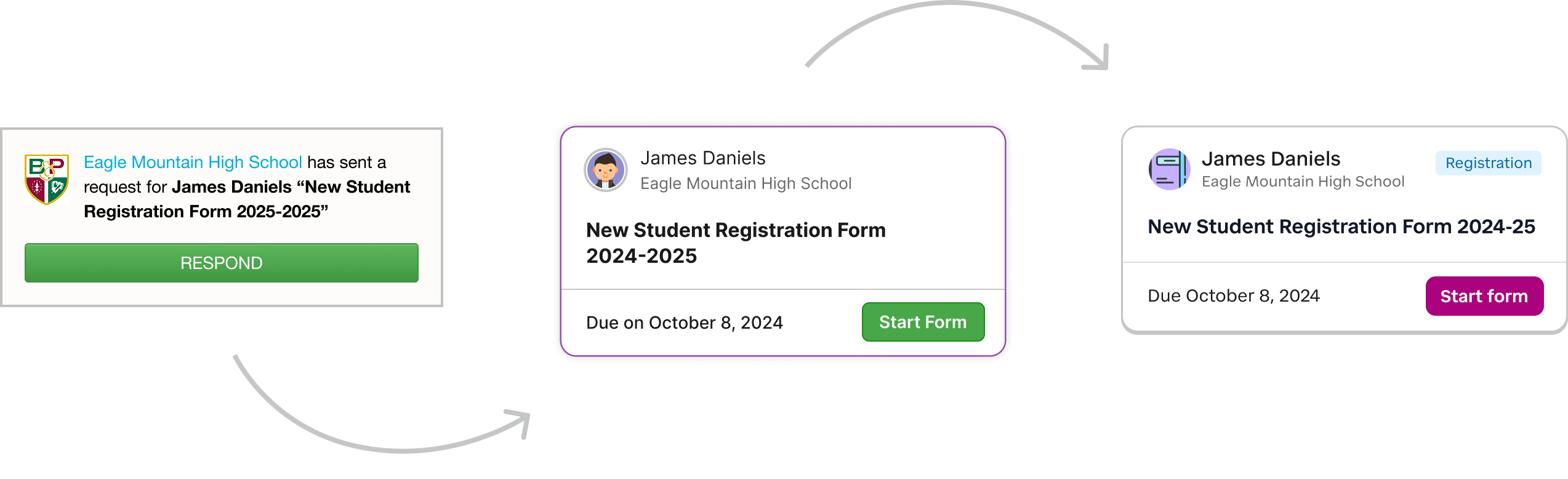
This was perhaps the chief user complaint and the most immediately obvious usability issue. The app distinguished forms that were requested by the school to be completed, versus those initiated by the end user from a collection of available forms.
Users had to remember how a form had been started just to find it again, and unfinished work was treated differently in both sections. These distinctions didn't matter to the user who just wanted to get in and get out.
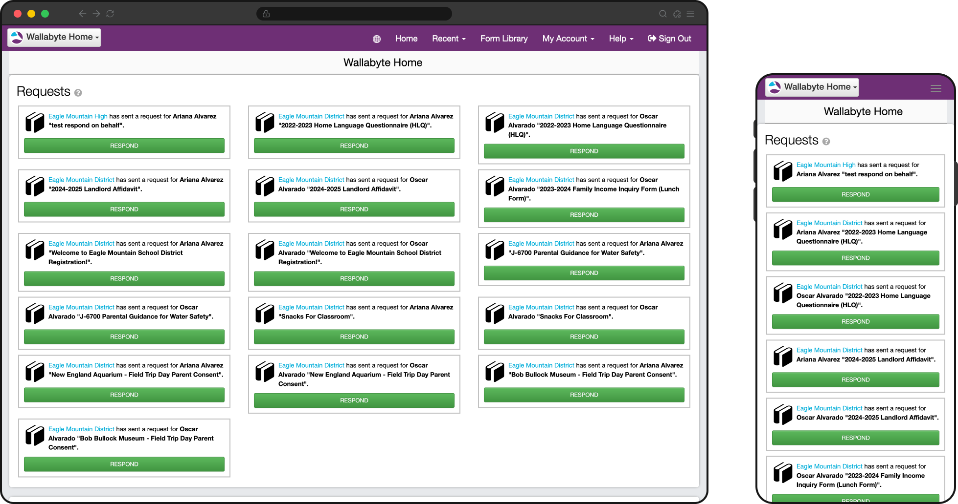
Users needed to remember if they responded to a form request (left) or if they started the form from their often massive library (right).
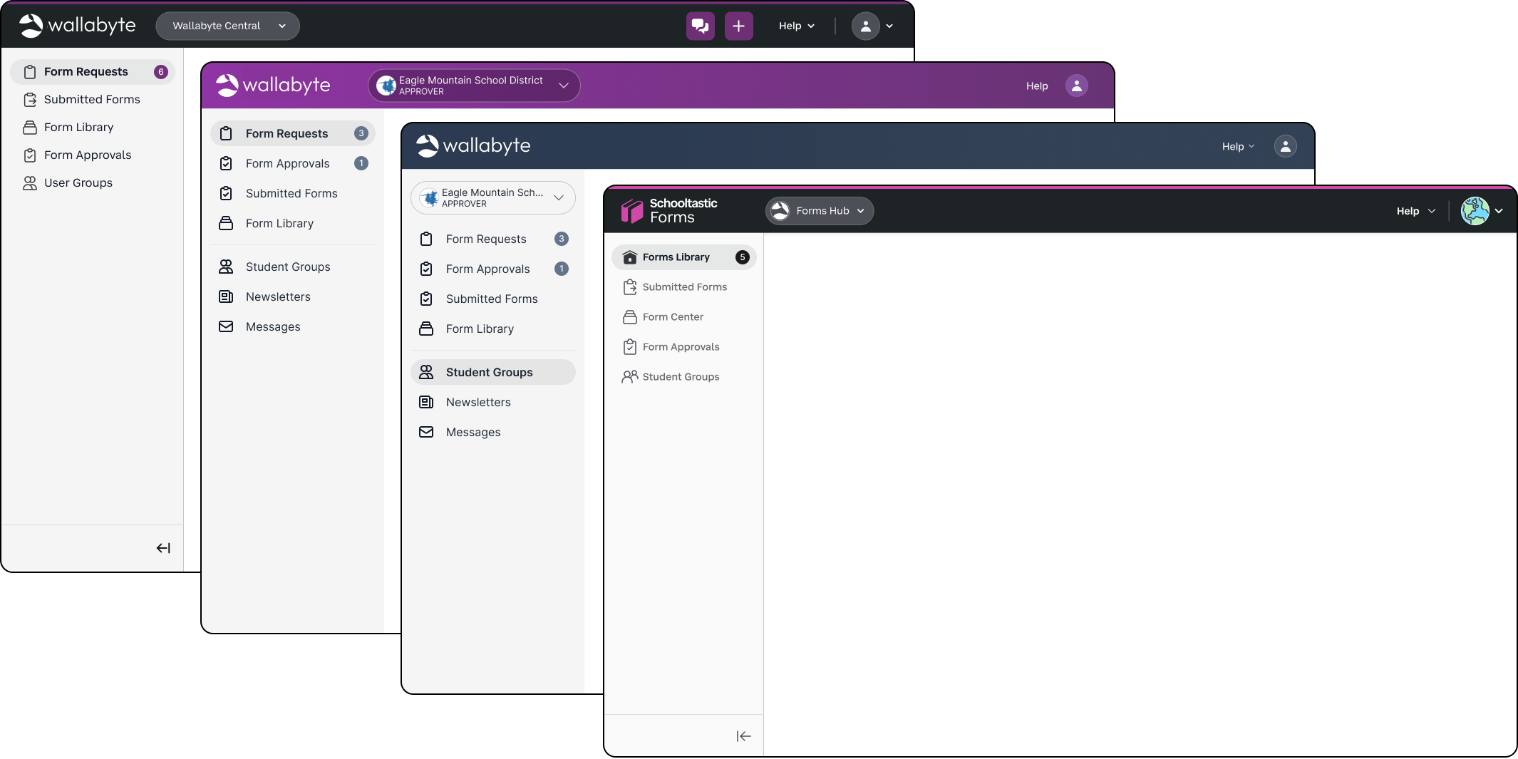
Highlighting this issue were the three distinct paths for a user to find the forms they submitted:
- Dashboard: at the bottom under the "Responded" section. This only showed recently submitted forms originally requested by a school.
- Form Library: again at the very bottom below the long list of available forms to start, containing the users self-initiated forms. This location often prevented users from ever discovering them.
- My Account, then "All eForm Responses": contained only the user's "eForm" responses, which was another word for those requested by the school. This was never clear to the user, and they often felt forms were missing from this list.
{{< /problem >}}
{{< problem title="Critical information and alerts were buried"
}}
One of the revelations during the project's research phase was that 94% of end users completed forms on mobile devices. Despite this overwhelming split, the app was never thought through from a mobile perspective and critical information—like alerts or approval requests—were buried at the bottom below static information or long lists.
Pages were never optimized and often zoomed out, 2-axis scrolling was prevalent on data-dense screens or those with tables, and completing forms with data inputs that were not browser-native created more problems than they solved.
Certain critical action items—like pending form approvals or student safety alerts—were buried at the bottom on mobile with no indication up top.
{{< /problem >}}
{{< problem title="Navigation was complex and frustrating"
}}
Users needed to answer simple questions like "What do I need to complete?" and "What is urgent for me to do," but the navigation and terminology reflected internal product logic and developer-speak instead of what made sense to the user.
- Responders found it difficult to find forms saved for later.
- Staff found it difficult to locate self-service forms, and with lists of often 50 or more, the lack of a search or filter made this impossible.
- Parents found the mobile app generally difficult to navigate.
- Staff who needed to approve certain forms were unable to see the approval once they submitted their response, and they blamed the navigation for this failure.
{{< /problem >}}
{{< problem title="Managing forms across multiple children felt confusing"
}}
Parents and staff often needed to act on behalf of multiple children or schools, but the interface didn't make it clear enough when it mattered.
Simple things made it harder for users to quickly scan, like only showing the school or group avatar instead of the student that the form was requested for. Users could easily lose track of whose information they were viewing or updating, or bounce around the app to check first.
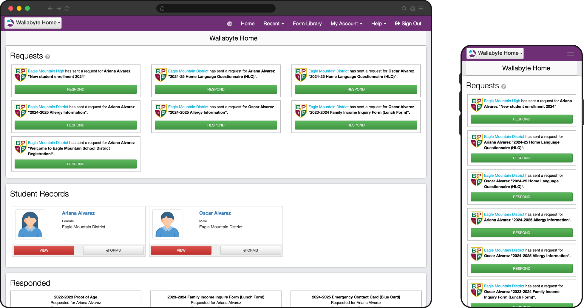
Parents of multiple children found it difficult to quickly identify which form was for whom. Even though the names are there, the redundant avatars and group information required extra thought.
{{< /problem >}}
{{< /problems >}}
{{< section id="context" title="Delivery context" >}}
The design problems themselves were clear enough, and we estimated roughly six months from early design through implementation.
A bunch of compounding delivery constraints, however, stretched this closer to eighteen months: distributed collaboration across many timezones, changing design direction, parallel system work, technical debt, and a product brief that changed too many times while the work was already underway.
The original brief was not good enough
This project reinforced one of my strongest product design beliefs: everything flows from the product brief. A well-researched and properly scoped product brief is what gives design and development a stable framework. Had this been done, all of the other issues below would have been totally manageable.
The original brief was directionally right but not validated enough up front, so scope changed in both directions as we learned more. That forced us to revisit work that had already been designed and restart discussions that should have been settled earlier.
The biggest example was multi-student handling. NYC's model—where users switched between separate student accounts—differed from how every other other customer used the product. This was well known, but because the value of that use case was not fully understood or incorporated into the brief early enough, we spent months researching and designing for cases that ultimately did not need a universal solution or would have worked for NYC's specific case.
A distributed team made day-to-day collaboration slower
The PM and I were based on the US east coast, while the development team was based in Australia. We made it work with weekly status calls at 8pm eastern to create some overlap, but the timezone gap slowed normal iteration.
Questions that might have been resolved in a Slack message turned into a full-day delay, and that was amplified by the fact that the team had no dedicated frontend specialist and needed more design support than usual during implementation.
We were redesigning the product while also creating a larger design system
At the same time of this project, Honeycomb, our design system, was under active development and beginning to show up in other platform products. This created a recurring strategic question: should this redesign fully adopt Honeycomb, or should it act as more of a stopgap refresh that preserved more of the existing product? Because leadership never fully committed to one path early enough, the design work sometimes had to serve both goals at once.
Original form card (left), stopgap "Wallabyte refresh" version (middle), and the final Honeycomb card ultimately implemented.
That ambiguity led me to create a temporary bridge between the legacy Wallabyte interface and Honeycomb so the team could keep moving. It helped in the short term, but it also created rework later when parts of that hybrid approach needed to be unwound.
Direction changed too often inside the design process
Day-to-day design direction also caused delay as visual and IA decisions were often revisited after work had already advanced, usually in ways that reflected aesthetic preference more than product or implementation reality. In practice, that meant screens changed without a shared review process, and patterns I had already aligned with engineering or the PM sometimes had to be revisited.
The app header was a perfect example of overthinking and tinkering to a fault. We had a version of the common header design ready in our design system and it made sense to introduce that part of the design system now—it wasn't that much different than the current header.
Some of the header variations. The beginning and end were not far off! Many hours were spent going over color and multiple account switching that ended up outside the scope.
Personal preference wedged its way in and a senior design leader felt strongly that the header's background color needed to signal the user's account type (parent, staff, approver, etc.).
We spent months alone on the header design, ultimately landing on the new Honeycomb header. This was an own-goal that could've been avoided any number of ways, and perhaps most efficiently through validating early on that user awareness of their account type was not an issue at all.
Technical debt and platform changes were taken on in parallel
The codebase itself was old and carried substantial technical debt. This alone is not a huge issue! I've spent years working with developers on old tech stacks and sometimes even prefer it.
The team, however, chose to address some foundational frontend concerns at the same time as this refresh, including introducing Tailwind to make future UI work faster and more consistent. While I understood the logic, it meant the redesign was competing with platform modernization work rather than simply being layered onto a stable front end.
{{< /section >}}
{{< section id="response" title="Response" >}}
This project did include a substantial visual refresh, and that was one of the goals outside of the usability issues. We moved the app meaningfully closer to Honeycomb by updating larger, easier components first, like the header, left navigation, and typography, along with some of the easier atomic elements like buttons, cards, inputs, and dropdowns.
But this was not a full design-system conversion. More complex patterns like tables and modals kept their legacy treatment, both because the project was dragging on and we didn't want to introduce too much change at once. What we did do was thoughtful and moved the app forward visually.
For this case study, the more important story is how we responded to the specific UX problems above. The redesign was not structured around blind design-system adoption, and it was certainly not driven only by my own visual taste. In a few key places—like the notifications-and-navigation widget on mobile and desktop—we introduced patterns created specifically for this product because user testing supported them so strongly. NYC users in particular responded extremely well, and keeping that work was a clear example of putting user feedback ahead of aesthetic instinct.
{{< response title="Reorganized forms around status instead of origin" lede="To remove the biggest source of confusion, I grouped forms by what state they were in, not by how they entered the system."
}}
What changed
I removed the distinction between requested forms and self-started forms as the main way the app was organized. Instead, users saw a simpler set of states—Requests, In Progress, Pending Approval, Completed—and a simpler Form Library for all of the available forms they could initiate themselves. Students also moved into a dedicated section instead of being mixed into form-related navigation.
Why it mattered
Users no longer had to remember how a form started just to find it again, forms instead fit their mental model. Just as important, it let us use the dashboard as an inbox as the app finally matched the question they were actually asking: What needs my attention, what have I started, and what have I already finished?
What this solved specifically
This change addressed the fragmented findability problem at the center of the legacy experience and gave both parents and staff a more predictable place to return to unfinished or completed work.
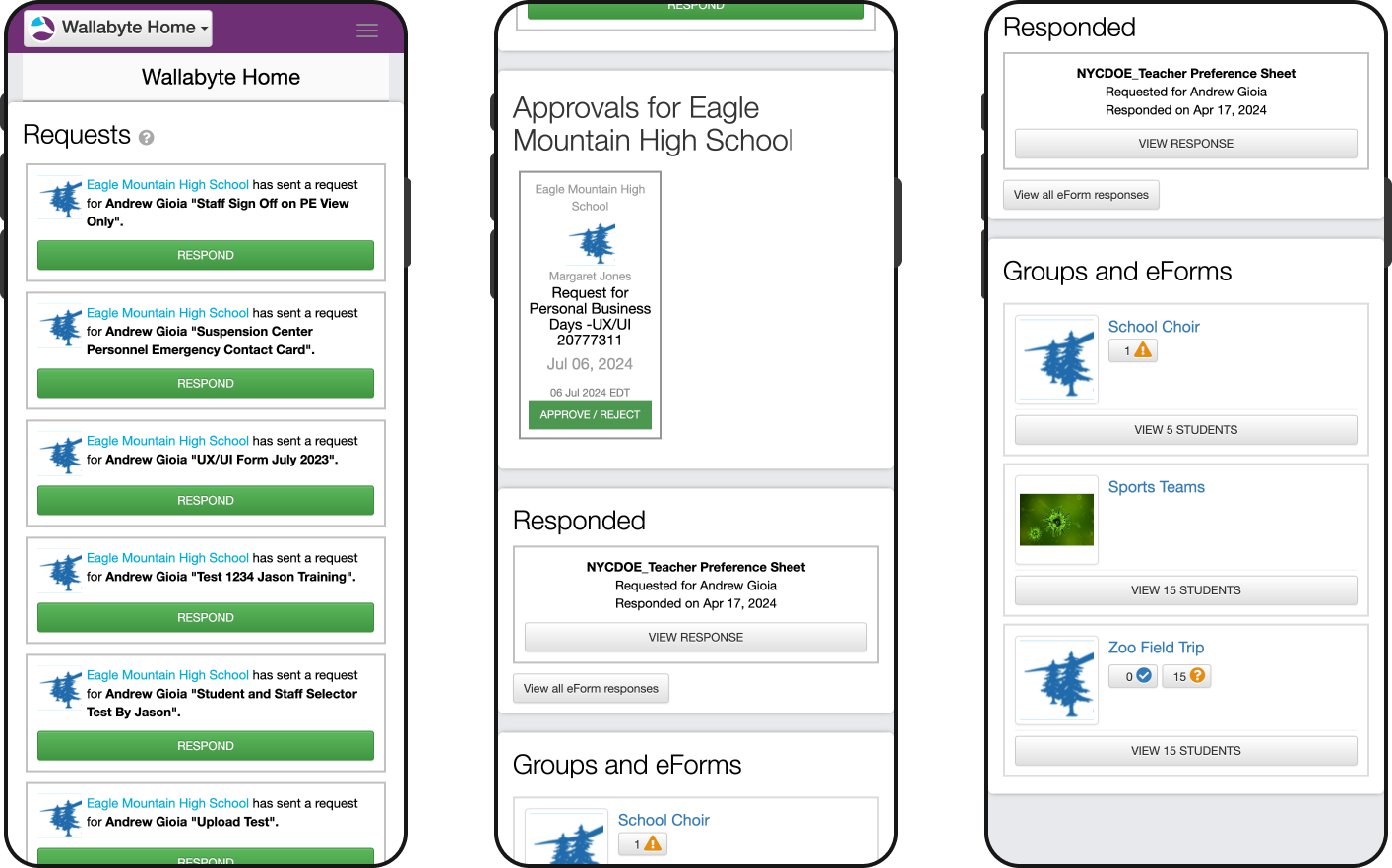
Forms are now organized by their status as opposed to separating them based on type.
{{< /response >}}
{{< response title="Urgent information moved to the top on mobile" lede="Everything had to work well on mobile, so we designed for it first. And the most important mobile intervention was bringing critical alerts and next actions to the top of the experience instead of burying them beneath static content."
}}
What changed:
I designed a mobile widget that surfaced alerts, approvals, and other to-do items immediately, before the user had to scroll through the rest of the page. It doubled as static nagivation to the form statuses and had a desktop variation as well.
We played around with a more traditional tab bar at the bottom or a simpler alert/notification icon in the header, but this new widget consistently tested well.
Why it mattered:
This is one of the clearest examples in the project of designing for the user rather than for my own aesthetic preference. I hated the way this looked on the screen and how much space it took up! It felt clunky and non-standard, but it tested very well with customers, helped users notice important items faster, and ended up creating real goodwill because the product finally felt more helpful.

Card-style buttons mirrored the mobile navigation + alert display for parents on desktop.
What this solved specifically:
It addressed the mobile-heavy reality of the product and eliminated all possibility that users would miss approvals, alerts, or other high-priority tasks simply because they were visually buried.
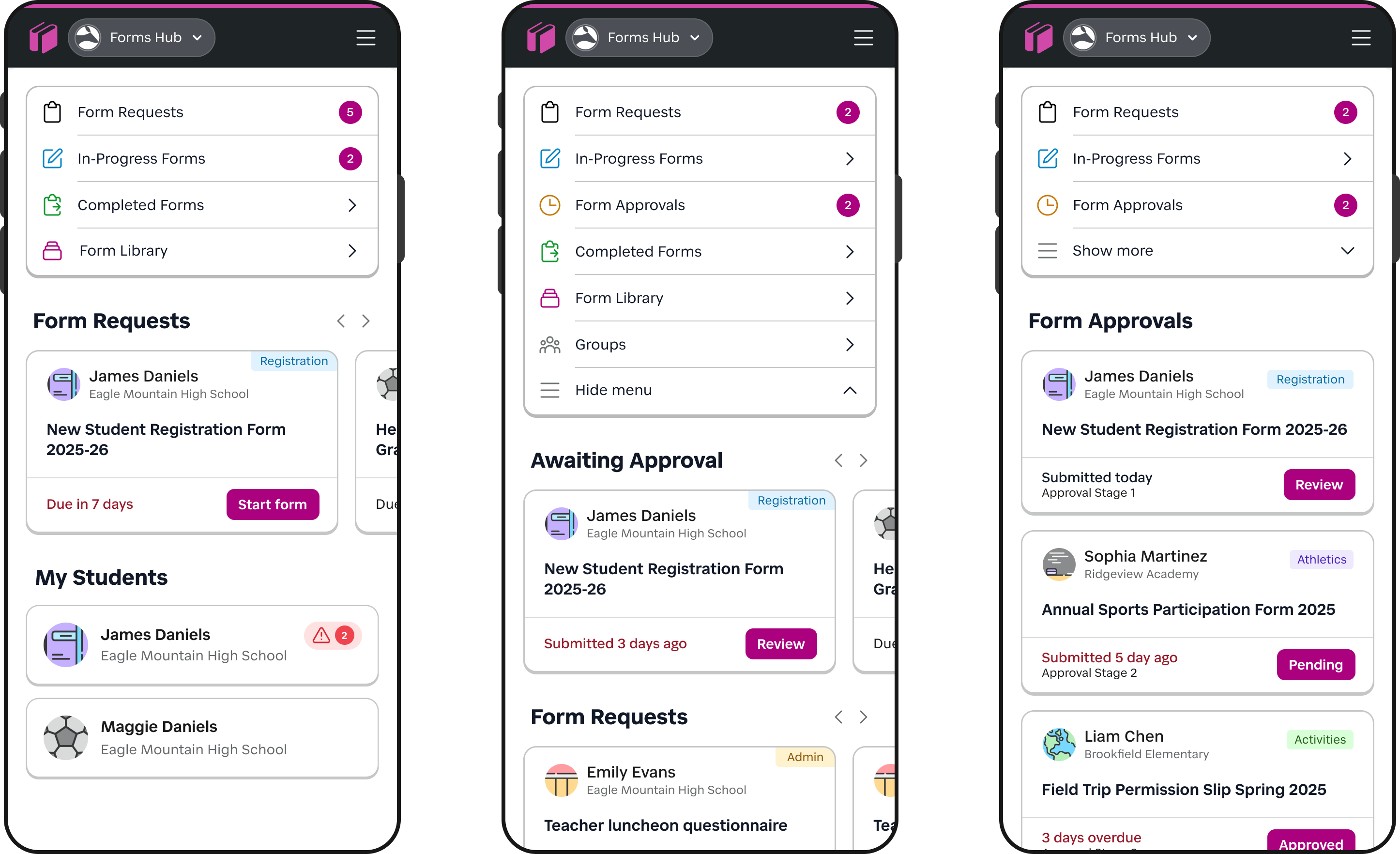
New alert + navigation widget for mobile solved 2 issues: alerts are always at the top now, and users can easily jump by form status.
{{< /response >}}
{{< response title="Removed navigation noise and clarified destinations" lede="Once urgent tasks were surfaced more clearly, I simplified the rest of the app so each major destination had a more obvious purpose."
}}
What changed:
I removed the unused Recent destination, simplified Form Library so it was only a place to browse and start forms, and made Students and Groups more consistent as sections. The old "Groups and eForms" section may have made sense for a backend engineer, but users no longer needed that unintuitive grouping.
I also reduced ambiguity between task-based navigation and account/settings navigation so users were not bouncing between unrelated menus.
Why it mattered:
This was less about drawing attention to a single urgent item and more about reducing background confusion. Users no longer had to interpret vague labels or remember locations of certain type of information.
What this solved specifically:
This work reduced the IA mismatch between how the product was structured internally and how users actually approached their tasks. It also made common destinations more visible and reduced wasted taps.
{{< /response >}}
{{< response title="Made student context visible wherever it mattered" lede="Instead of inventing a universal context-switching solution, I focused on making the relevant student context obvious at the moments where users actually needed it."
}}
What changed:
I standardized form cards so they consistently showed the student avatar, group name, and student name, making each request easier to scan and distinguish. I also improved the student profile experience on mobile so teachers and staff could access important student information more easily without bouncing through the interface or piecing context together from multiple screens.
Why it mattered:
Users dealing with multiple children, groups, or school contexts needed clarity more than novelty. Making context explicit in the card pattern and profile views reduced hesitation, made the interface more trustworthy, and solved the problem in a way that respected the product's actual data model.
What this solved specifically:
This was a more practical and effective answer to the multi-student problem than the broader universal switcher concept we explored earlier in the project. It improved scanability without adding a heavier interaction model the product did not really support.
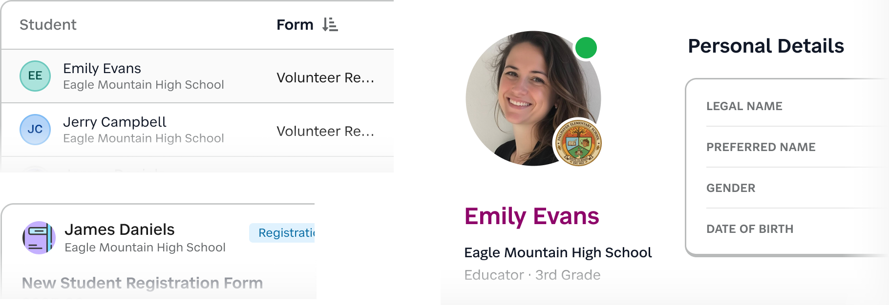
Whenever students or teachers were presented, we included their name, group, and avatar in a consistent way. We also introduced standard sets of avatars with a high-contrast initial fallback.
{{< /response >}}
{{< /section >}}
{{< section id="impact" title="Impact" >}}
I wasn't able to uncover the kind of clean post-launch measurement I would ideally want here. We didn't run a formal NPS follow-up for this work, and I haven't been able to locate retention reporting detailed enough to isolate the redesign's exact effect on churn.
Still, the signals around this release were strong enough that I feel comfortable describing its impact at a high level.
The churn risk that started the project did not materialize
The most important outcome is the simplest one: the redesign addressed a product experience that had become serious enough to threaten major customer relationships. NYC DOE not only stayed, but expanded its substantial subscription of Schooltastic Forms. For a project that began as a usability response to dissatisfaction, that is the clearest business signal I can point to.
The product continued to grow commercially after release
Forms ARR increased year over year in both 2024, when this redesign was released, and again in 2025. At the time of preparing this, early 2026 is also continuing in the same direction.
I would love to supplement this case study with more specific revenue figures, but even without them, the broader trend matters: the responder experience did not become a drag on the product's growth, and Schooltastic continued to invest in it.
Customer response was consistently positive
While I also don't have a nice headline metric to quote, I do have repeated qualitative feedback from the people closest to customers. Parents and staff consistently responded well to the updates, and follow-up conversations with the PM and account team reflected a lot of positive buzz around the improvements. The mobile alert and navigation widget, in particular, generated much stronger support than I would have predicted from my own design instincts alone.
That matters to me because it reinforces one of the central lessons of this project: the right interaction is not always the one I find most visually elegant. In this case, the version that felt most helpful to users was also the one that built the most goodwill.
The redesign created momentum for broader platform work
This project didn't end with the initial release! Since then, the responder-facing side completed its Honeycomb transition and the remaining areas of that experience have been brought forward as well. Just as importantly, Schoolstastic has now moved on to the much larger administrative half of the original Wallabyte product.
That next phase includes a full rethink of form creation and administration workflows, including a new editor experience. This was only prioritized because the responder-facing redesign succeeded well enough to build confidence, reduce risk, and justify tackling the larger half of the platform.
Taken together, I think the impact of this work is best understood less as a single KPI spike and more as a chain of outcomes: a major customer stayed, the product continued to grow, customers responded positively, and the company gained enough confidence to invest in the much larger redesign that came next.
{{< /section >}}
{{< section id="reflection" title="Reflection" >}}
The biggest lesson I carried forward from this project is that large customers do not all experience "good design" the same way. Because I had already spent years working at a company with NYC as a major customer, I knew they were especially resistant to drastic interface change once their admins and staff were comfortable with a tool that met their needs.
They were also quick to escalate around downtime, missing data, or broken workflows. That context shaped several of my decisions here: I advocated against a full Honeycomb rollout in one pass, pushed to keep the updated color palette closer to Wallabyte's original purple, and was extremely cautious about disrupting account-switching behavior that users had already learned. The right move was not to freeze the product, but to improve it progressively without breaking trust.
More broadly, this project reinforced what I believe about designing admin software, whether in edtech or any other B2B environment. A modern or trendy UI can never be the primary goal in B2B; stability, continuity, and a logical UX matter more. But that does not mean these products have to stay clunky! The opportunity is to improve UX and UI in every release in a way that is thoughtful, cumulative, and respectful of how people actually work. In practice, that often means choosing the clearest solution over the prettiest one, and accepting that consistency for the user matters more than novelty for the designer.
Finally, this project strengthened my belief that everything starts with the product brief, and that the designer should be involved in shaping it early. Many of the delays, reversals, and unnecessary explorations in this work can be traced back to a brief that was not tight enough at the start. When the problem definitions are clear, design and development can move with much more confidence. When it is not, even good teams spend energy solving the wrong thing.
{{< /section >}}