7.0 KiB
| title | layout | slug | summary | draft | hero | study | |||||||||||||||||||||||||||||||||||||||||||||||||||||||||||||||||||||||||||||||||||||||||||||||||||||||||||
|---|---|---|---|---|---|---|---|---|---|---|---|---|---|---|---|---|---|---|---|---|---|---|---|---|---|---|---|---|---|---|---|---|---|---|---|---|---|---|---|---|---|---|---|---|---|---|---|---|---|---|---|---|---|---|---|---|---|---|---|---|---|---|---|---|---|---|---|---|---|---|---|---|---|---|---|---|---|---|---|---|---|---|---|---|---|---|---|---|---|---|---|---|---|---|---|---|---|---|---|---|---|---|---|---|---|---|---|---|---|---|---|---|---|
| Legacy app refresh | study | legacy | Reshaping a complex and outdated school forms workflow into a clearer, calmer experience for administrators and families. | false |
|
|
{{< intro id="intro" title="Designing for clarity over polish in complex admin software" >}}
Wallabyte† supports schools and families through critical paperwork—from permissions to registrations and even student health information. It solved this and more, but was woefully unusable, even by admin-ware standards. The forms experience had become frustrating enough that major customers, like NYC, were at risk of churn unless the workflow became clearer, calmer, and easier to use.
This case study covers how I approached that challenge—from identifying the highest impact issues to shaping a more coherent forms experience—all within the paradox of a userbase simultaneously frustrated yet resistant to change.
It is also meant to show how I simplify complex systems; work in a difficult set of circumstances; and design to please the user, not myself.
{{< /intro >}}
{{< overview id="overview" title="Project overview"
}}
Wallabyte had two halves: an administrative app for creating and managing forms, and a parent- and staff-facing app for completing forms. This redesign only touched this second, smaller part—called Wallabyte Central—due to the particular churn risk it was creating.
The existing experience had become painful enough that major customers, including NYC, were at risk of leaving unless the product became significantly easier to use. My job was to figure out how to make their mobile and desktop experiences more efficient and pleasant.
At the same time, Wallabyte was also rebranding as Schooltastic Forms, now a year after it had been acquired by Schooltastic. This project was my first interaction with this app and team, and not only did I have to get up to speed quickly, its users could be seeing a lot of sudden change.
{{< /overview >}}
{{< problems id="problems" title="Core problems" >}}
We identified four main UI/UX issues to target in this refresh, following my own deepdive into the product and several meetings with the product manager.
I was fortunate to share an entirely fresh set of eyes on a mature product, and it helped question a lot of assumptions that had been taken for granted over the yers. This app necessitated multiple demo accounts with different permissions and scopes, and I spent the first week cataloguing my experiences trying to perform a number of tasks from the PM.
These four problems became the core problem statements we used to frame the work and evaluate whether the redesign was actually solving the right things. The PM initially estimated a six-month path from early design through implementation.
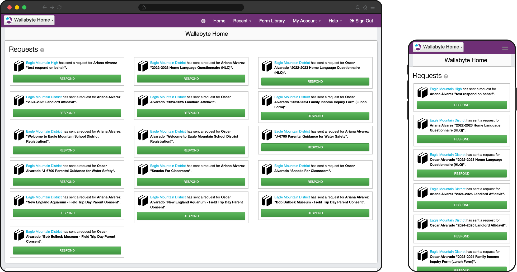
{{< problem title="Forms were too hard to find and track" image="img/overview.png" alt="Legacy interface showing forms split across different lists and patterns" caption="Representative legacy flow showing how requested, in-progress, and completed forms were fragmented across the experience."
}}
This was perhaps the chief user complaint and the most immediately obvious usability issue. The app distinguished forms that were requested by the school to be completed, versus those initiated by the end user from a collection of available forms.
Users had to remember how a form had been started just to find it again, and unfinished work was treated differently in both sections. These distinctions didn't matter to the user who just wanted to get in and get out.
{{< /problem >}}
{{< problem title="The app was designed for desktop, but used primarily on mobile" image="img/overview.png" alt="Legacy interface showing desktop-oriented structure despite mobile-heavy usage" caption="Representative legacy flow showing structure and density that translated poorly to mobile use."
}}
Despite 94% of end users completing forms on mobile devices, the app was never thought through from a mobile perspective.
On mobile, critical actions were buried below static information or long lists, pages were never optimized and often zoomed out, 2-axis scrolling was prevalent on data-dense screens, and staff members with sometimes hundreds of forms never saw critical alerts.
{{< /problem >}}
{{< problem title="Navigation was complex" image="img/overview-mobile.png" alt="Legacy mobile flow showing navigation and terminology that did not match user mental models" caption="Representative mobile flow showing navigation and task structure shaped more by product logic than user intent."
}} Users needed to answer simple questions like “What needs my attention?” and “Where do I go next?”, but the navigation, terminology, and underlying data model reflected internal product logic instead of user mental models. {{< /problem >}}
{{< problem title="Managing forms across multiple children, schools, or contexts was confusing" image="img/overview-desktop.png" alt="Legacy desktop interface showing form management across multiple children or school contexts" caption="Representative desktop screen showing how scope and context could become unclear across children, schools, or approval states."
}} Parents and staff often needed to act on behalf of multiple children, schools, or approval and reporting contexts, but the interface did not make that scope clear enough. Users could easily lose track of whose information they were viewing or updating. {{< /problem >}}
{{< /problems >}}